
Does the below image make you a little crazy?
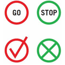
In my head, the color red always represents an error, or the word “stop” or something along the lines of there being an issue. On the opposite side, green means to “go” or that things are okay. Flipping their meanings destroys the usability of the product they’re attached to. E.g. a cell phone with a red button for “answer call” would never work for me.
The more usable a product is, the more likely it will expand to having more users. The more likely a user will be to return. The easier something is to operate, the more likely someone will use it.
The ISO definition of usability is, “The effectiveness, efficiency, and satisfaction with which a specified user can achieve specified goals in particular environments.” To break that down though, there are five dimensions of usability.
- Learnability: When using something for the first time, how easy is it to figure out? I’ve signed up for and bailed on many software products in my time because I couldn’t figure out how to use them quickly. The faster a new user can learn to use your product, the more likely they are to continue using it.
- Efficiency: Once the basics have been learned, how fast can users accomplish more advanced tasks? This applies to video games, software products, and more advanced tooling. E.g. a door does not have advanced functions to learn the way a photoshop or video editing tool does.
- Memorability: After a period of non-use, can users recall quickly how to use the product? Like riding a bike. Being able to pick up where you left off and regain confidence with the product is a big deal. In general, the simpler the design and higher degree of learnability will translate to a higher degree of memorability.
- Errors: Are users making many errors? Few errors? How severe are those errors? Can they recover quickly? Will they know they made an error? Sticking with the bike example, falling off a bike can be severe. Recovering from that may be difficult. Hence the addition of training wheels for young kiddos.
- Satisfaction: Is the design of the product pleasant? Does it look good? Does using the product feel good? Is there a rewarding feeling to holding or interacting with the product?
Apps, software tools, games, phones, computers, cars, power tools, sound systems, fishing poles, instruments, ovens, microwaves, and any other product being designed should take these criteria into consideration.
Some of the adjectives to aim for when designing new products, landing pages, games, or other stuff;
- Trustworthy
- Appropriate
- Smart
- Responsive
- Ludic (encouraging play)
- Pleasurable
Next time you’re designing anything, keep these in mind and iterate with your customers or users as fast as possible.
